
Photography
Every image is generated from one fixed recipe so the whole library feels like a single shoot. Keep the art-direction block constant; change only the one subject line. Each photo below ships with the exact reverse prompt to regenerate it.
The master prompt
Paste the whole block into ChatGPT (GPT-Image 2.0). Hold the art direction fixed across every generation — it's what makes the set cohesive — and swap only the SUBJECT line plus the aspect ratio. Generate one image per message for best quality.
Photorealistic editorial photograph for Pierce Law Group, a premium North Carolina estate-planning, probate, and elder-law firm. The image must feel warm, calm, trustworthy, and quietly luxurious — never corporate-stocky, never staged.
SUBJECT: one shot's reverse prompt from the gallery below
- Mood
- Reassuring, intimate, white-glove; "calm in the chaos." Multi-generational legacy and family — never litigation or courtrooms.
- Palette
- Warm neutral — ivory, oatmeal, soft taupe, sand, with deep navy and muted antique-gold / champagne accents. Earthy, low-saturation, no neon.
- Light
- Soft natural window light, golden-hour warmth, gentle falloff, airy highlights. Full-frame, 35–50mm, shallow depth of field, fine film grain.
- Composition
- Generous negative space and clean background areas for overlaying white / gold text later; rule-of-thirds; subject weighted to one side. Editorial, magazine-quality.
- People
- Warm, candid, authentic North Carolinians of varied ages and ethnicities; natural styling; genuine expressions; hands and small gestures over posed eye-contact. No exaggerated smiles.
- Setting
- Tasteful Southern home interiors, front porches, oak trees, warm wood, linen, heirloom objects (rings, letters, keys, photo frames); Raleigh / Durham residential feel.
- Never
- No text, lettering, logos, watermarks, UI, scales-of-justice clichés or gavels. Clean, realistic, professional.
ASPECT RATIO: 16:9 wide hero · 3:2 section · 1:1 card · 4:5 portrait
Library & usage
When to reach for each image, and the reverse prompt that recreates it. Filenames live in /design-system/photos/.
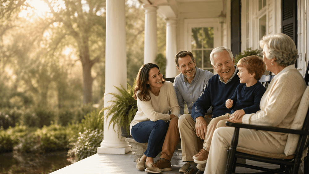
Primary homepage hero. Lead banners where family, warmth, and trust are the headline message.
SUBJECT A multi-generational Southern family — grandparents, adult children, and a grandchild — seated together and laughing on a sunlit white-columned front porch; warm golden-hour light, deep soft-focus garden behind; generous negative space on the left third for a headline.
family-porch.png 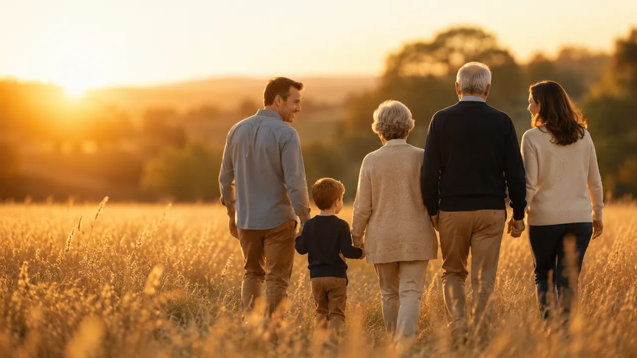
Emotional full-bleed CTA or legacy / continuity banner — works best with the headline set into the open sky.
SUBJECT A family of five seen from behind, holding hands and walking slowly away through a golden field of tall grass at sunset, a small child in the middle; vast warm sky overhead for overlay text.
family-sunset.webp 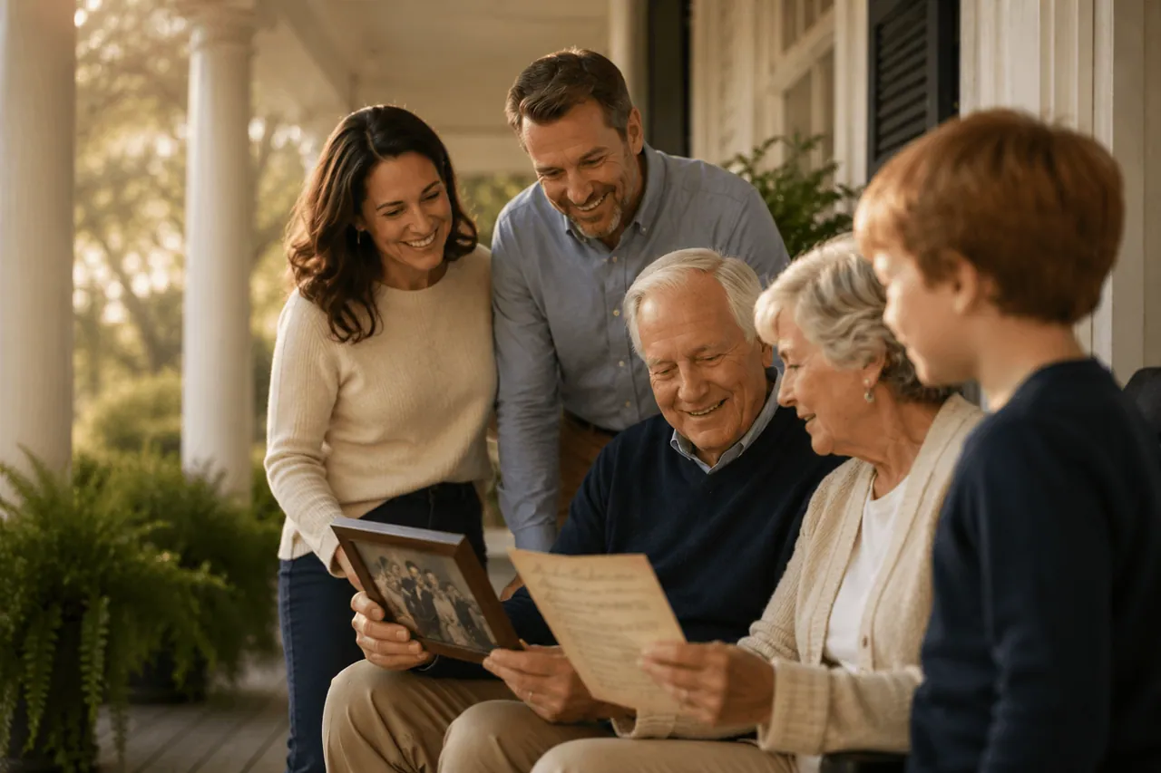
"Why choose us" / story sections; a warm mid-page band that shows attentive, intimate guidance.
SUBJECT The same Southern family gathered close around a seated grandfather on a porch, all looking down warmly at an old framed photograph and a letter in his hands; intimate, candid, shallow depth of field.
family-porch-closeup.webp 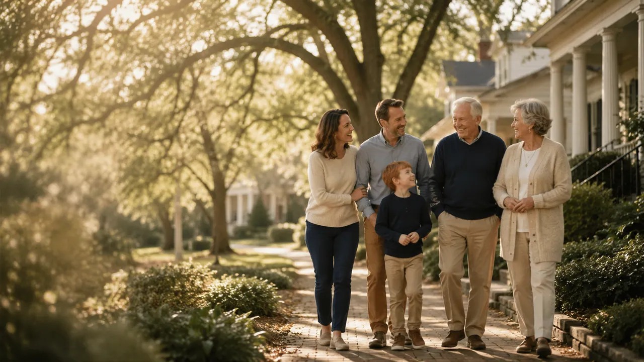
Locations, community, and About pages — "we serve families across North Carolina."
SUBJECT A multi-generational family walking toward camera down a tree-lined established Southern neighborhood sidewalk in dappled late-afternoon light; relaxed, unhurried, candid.
family-sidewalk.webp 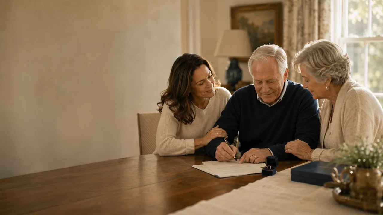
Estate-planning process steps; "sign your plan" — reassurance that the work gets done with you.
SUBJECT A warm female attorney leaning in beside an older couple at a wooden dining table in a softly lit home; the husband signs a single document with a fountain pen; calm, reassuring, soft window light.
family-sign.webp 
Consultation, "meet an attorney," and contact-page trust building. The most composed / professional of the family set.
SUBJECT A composed female attorney reviewing and signing estate documents with an older couple across a wood table in a quiet home office; soft window light, trustworthy and professional.
family-signature.png 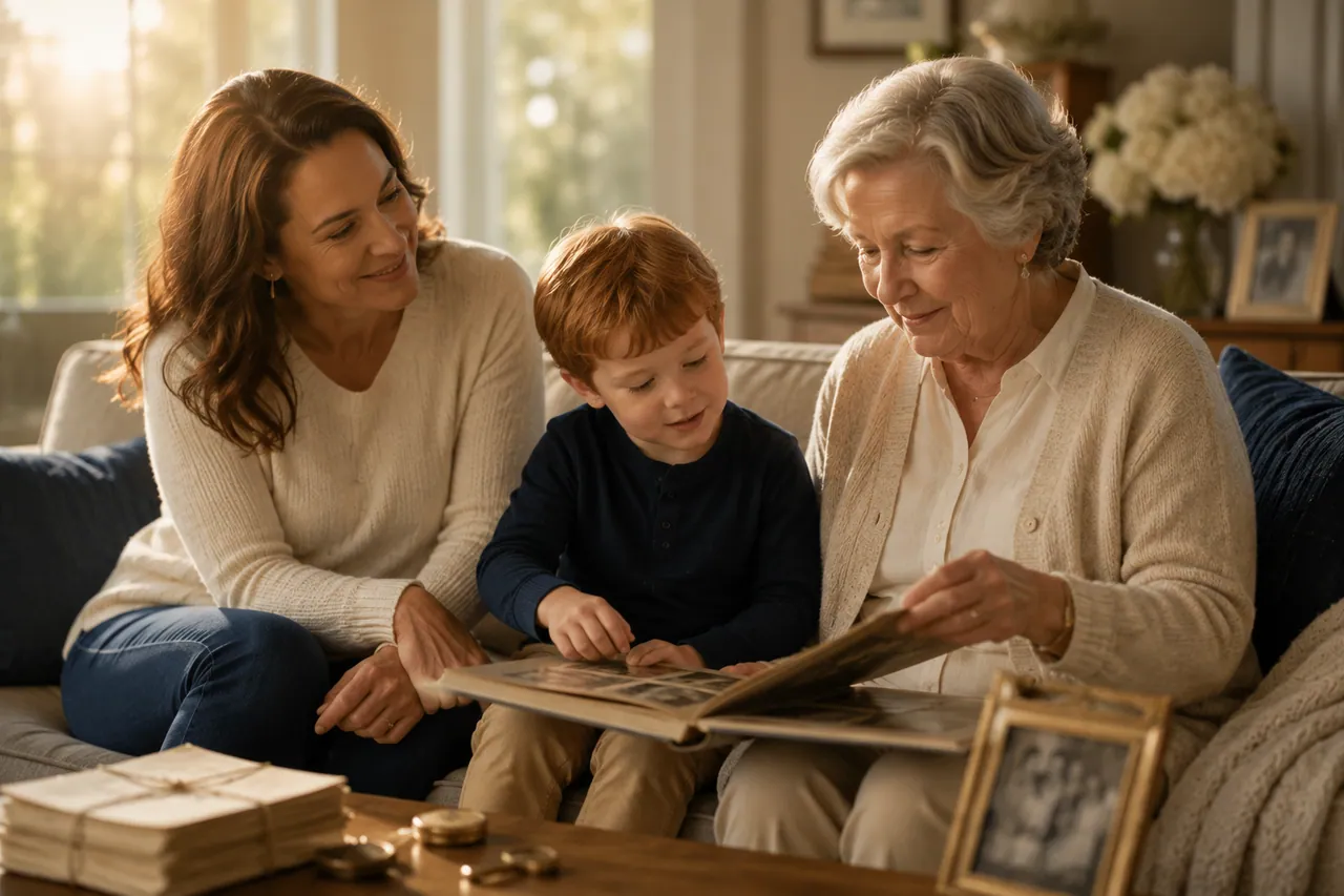
Legacy, memories, and probate-with-heart; pairs well beside a testimonial.
SUBJECT A mother, a young red-haired boy, and a grandmother sitting together on a linen sofa turning the pages of an old photo album; framed family photos and warm lamplight around them.
family-album.webp 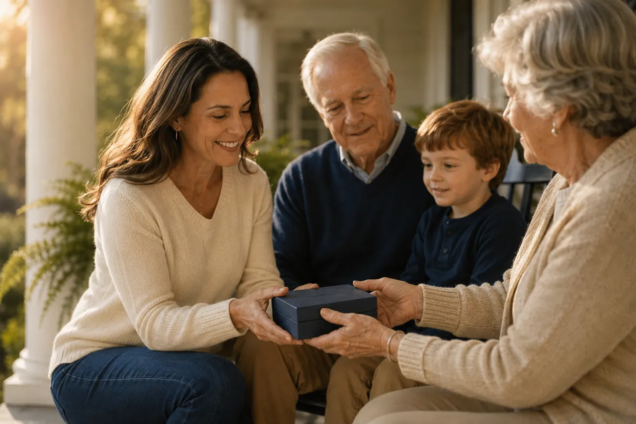
Square cards on gifting / legacy / "passing it on" themes.
SUBJECT On a sunlit porch, a smiling daughter offers a small navy keepsake box to her elderly parents while a young grandson watches; genuine warmth, candid gestures, shallow depth of field.
family-gift.webp 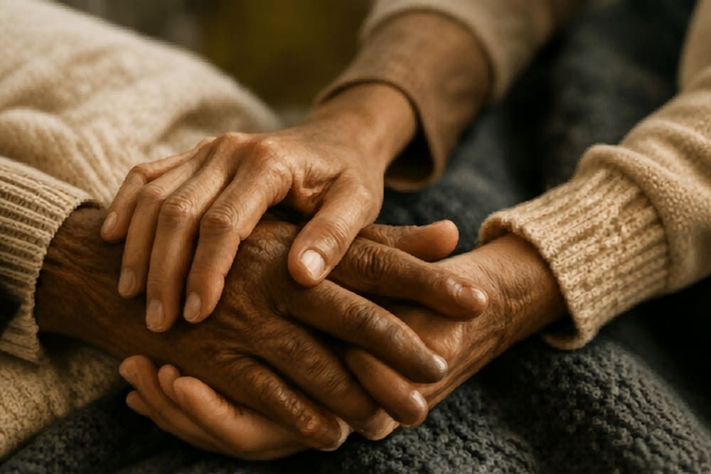
Square accent behind pull-quotes; elder-law and compassion moments. Strong, calm focal point.
SUBJECT Extreme close-up of a younger hand gently clasping an elder's weathered hands resting on a soft knit blanket; warm tones, fine film grain, shallow depth of field.
elder-hands.jpg 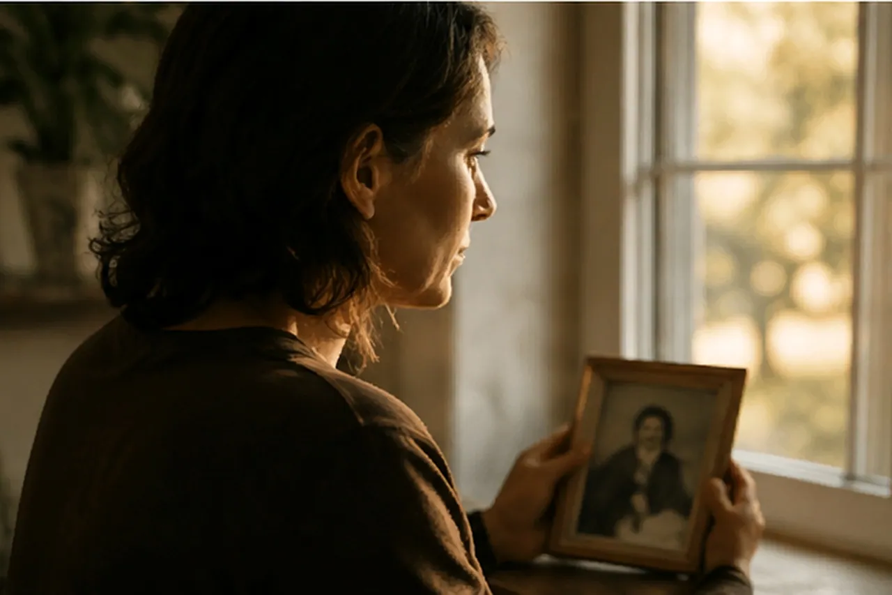
Sensitive grief & probate contexts only — loss of a loved one. Use sparingly and respectfully.
SUBJECT A woman standing at a window in warm low light, holding a small framed portrait of a loved one to her chest, contemplative and tender; soft grief, respectful, intimate.
sad.webp 
Guardianship and planning for minor children; gentle family-protection theme.
SUBJECT A well-loved teddy bear sitting upright among a few old hardcover books on a warm wooden shelf in soft golden light; gentle, nostalgic, protective mood.
teddy-bear-for-child.webp 
Blog / resources headers; an editorial neutral background with plenty of room for text.
SUBJECT Still life on a dark wood table by a window: an open leather journal with a fountain pen resting across it and two ceramic coffee mugs; soft backlight, editorial calm, room for text.
documents.webp 
Probate and document-heavy service pages; conveys diligence without courtroom clichés.
SUBJECT Close still life of a neat stack of aged leather document portfolios filled with cream papers on a polished dark-wood desk, a fountain pen alongside; warm directional light.
legal-documents.webp 
CTA accent; "make it official" / wills & signing. Dramatic and cinematic — good under a scrim.
SUBJECT Tight close-up of a man's hand signing a formal document with a black fountain pen, cuff of a navy suit visible; dramatic warm light, deep shadow, cinematic.
legal-sign.webp Do & don't
- Lead with warm natural light and golden-hour falloff.
- Leave negative space — the headline lands in the image.
- Favor hands, gestures, and candid moments over posed grins.
- Cast varied ages and ethnicities in real Southern-home settings.
- Hold the warm neutral palette: ivory, taupe, navy, antique gold.
- No cool / blue corporate stock or fluorescent office light.
- No gavels, scales, or courtroom clichés — use Illustration instead.
- No exaggerated smiles or stiff eye-contact-at-camera poses.
- No busy backgrounds that leave nowhere for text.
- No baked-in text, logos, or watermarks.