
Email principles
How Pierce email is built so it lands, renders, and reads on-brand in every inbox. Unlike the rest of the system, email is a standalone medium — table-based layout, inline styles, hardcoded hexes — because Outlook, Gmail, and Apple Mail strip <style>, ignore flex/grid, and can't read CSS variables. The voice and palette still match the site; the plumbing is built for deliverability. The Templates page is the asset library you copy from.
src/lib/email-templates.ts and renders to absolute production URLs when copied.
Typography — brand first, safe fallback
Lead with the brand serifs, then fall back to a near-identical web-safe stack so the email never breaks where web fonts are blocked.
| Role | Brand face | Email stack (with fallback) |
|---|---|---|
| Display / headings | Cormorant Garamond | 'Cormorant Garamond', Georgia, 'Times New Roman', serif |
| Body / lede | Newsreader | 'Newsreader', Georgia, 'Times New Roman', serif |
<link> (and an @import backstop) in the email <head> — honored by Apple Mail & iOS. Outlook and Gmail ignore web fonts and fall back to Georgia, which carries the same editorial weight, so the layout never shifts.Logo — the real wordmark, as PNG
Email clients (Gmail especially) don't render SVG, so the wordmark ships as a crisp retina PNG in two finishes. A CSS swap shows the navy mark on light and the white mark on dark.


prefers-color-scheme + Outlook's [data-ogsc]. The dark logo is wrapped in <!--[if !mso]> so desktop Outlook (no dark mode) keeps the navy mark.Color foundations
The exact hexes every template inlines — no tokens, because clients can't resolve them.
Imagery — photos & illustrations
Both asset families are already raster PNG/JPG, so they drop straight into email. Photos set an emotional tone; the engraved illustrations carry sections and features where a photo would be too heavy.
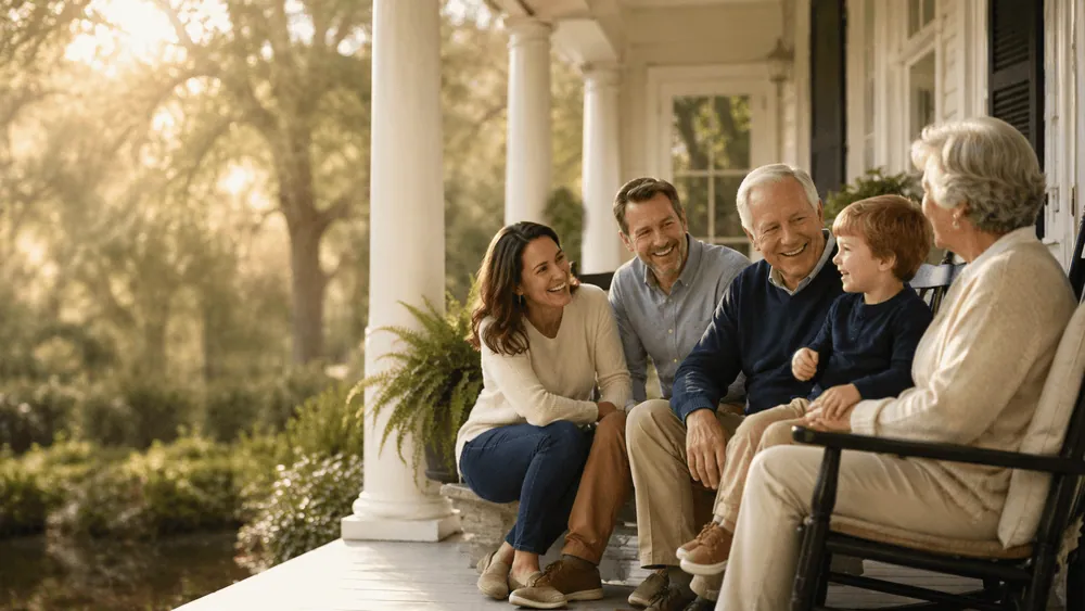



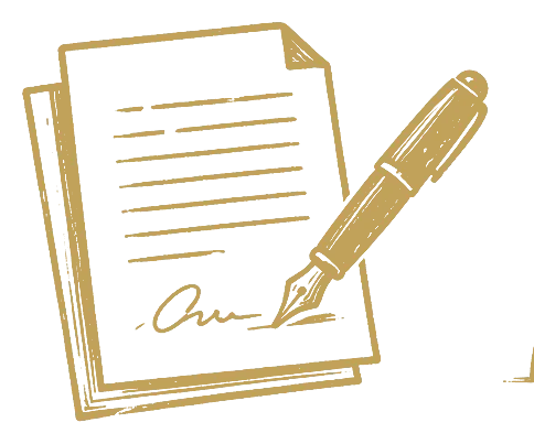
- Always set
width+heightanddisplay:block— prevents Outlook gaps and layout shift. - Meaningful
alton photos; emptyalt=""on decorative illustrations. Many clients block images by default, so the email must read with images off. - Use the gold illustration colorway on dark bands (ivory/navy variants exist for light surfaces).
- Hero photos go full-bleed at 600 px (3:2 → 600×400, 16:9 → 600×338) and scale to 100% on mobile.
Built for delivery
The constants every template inherits so messages render the same across clients and stay out of the spam folder.
| Concern | How it's handled |
|---|---|
| Layout | Role-presentation tables, 600 px fixed container, inline styles only |
| Outlook | MSO conditional wrapper + PixelsPerInch fix; buttons are padded <a> on a bgcolor cell |
| Dark mode | <meta color-scheme> + prefers-color-scheme + Outlook [data-ogsc] swaps |
| Mobile | Single @media (max-width:600px) stacks every .stack column & fluid image |
| Inbox preview | Hidden preheader line + zero-width spacer so the snippet reads cleanly |
| Spam-safe | Text-forward (not one big image), real links, plain unsubscribe, attorney-advertising line |